
The Goal
Judge.me is a review platform which helps consumer find good products through verified reviews.
In this UX assessment project, my goal is to imagine the shopping experience for consumers on the Judge.me platform.
Business Understanding
First, please allow me to analyze the brief a little bit, so that I can have a better understanding of what I am designing for.
From my experience of building a platform, I’ve learned that for a platform to work, there’s got to be two sides: platform producers and platform consumers, who exchange value unit.
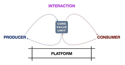
In the case of Judge.me, I think it’s necessary for me to determine what the value unit is, because there can be a few options.
- If the value unit is reviews, then the producers are reviewers – the buyers who write review.
- If the value unit is products, the the producers are shopowners, who list their products onto the platform to be discovered by consumers.
- If both reviews and products are value units, then this will result in a multi-sided platform, which is even more complex.
Each has its own pros and cons and will define how the platform works. I have taken the liberty to go with the first option, in which reviews are the value units, reviewers as producers, and buyers as consumers.
Now that we have identified that the value unit for Judge.me is reviews, here is a couple of things that I discovered. Apart from being generated by reviewers ( through the from Judge.me review app, now considered part of the platform), reviews can also be crawled from other marketplaces (amazon, walmart, ebay, etsy, other shopify stores…). This way, Judge.me can simply take a service approach, where it simply populates a list of products and reviews for buyers to consume. This would narrow down the range of users, and make the product more focused. But that’s just my opinions.
For the scope of this test, I’m going to stick to the brief that Judge.me is a platform and continue with it.
Platform Understanding
In short, Judge.me is a product review platform connecting between reviewer and buyers.
- Reviewers: buyers who leave reviews for the products that they bought, out of goodwill or other incentives.
- Buyers: looking for products to buy based on the reviews left by reviewers.
From my experience of building a platform, one of the most troublesome aspect is solving the chicken-and-egg situation, as in which side do we focus on growing first, the reviewers or the buyers. However in the case of Judge.me, we already have millions of value units (reviews) and thousands of reviewers that they can have access to (through emails, I would assume).
The reviewers using the Judge.me app may not necessarily realize that they are creating value units for the platform, after all they are simply giving reviews for a product. Here, the mental modal is a little bit different then if we were to onboard the reviewers to the platform, then the intention of leaving reviews would be for them to be seen by other platform users. It’s a small but important difference.
Normally for a platform, we should focus on the producers first, since they are the ones who are creating the value, without which there will be nothing to consume. In the case of Judge.me however, the producers and value units have already been established in a way, therefore, in this project, I will focus on the consumers/buyers.
Another things that affect the design of the platform is the business model, as in how the platform is going to make money. In my opinions, there can be a couple of ways:
- Referral/commission: if the platform decides to earn money from referrals, it must show products and reviews in a good light, so that consumers are inclined to make the purchase.
- Ads: consumer-centric, allow buyers to have an unbiased, objective look at the products by showing not just the good reviews, but also the bad things. This, however, may not be of the best interest to the shopowners, and may hurt sales. The monetization method can be running advertisements on the site and be an independent entity.
- Both: if we want to be a little bit greedy, then why not.
Do we lean more towards shopowners or buyers is a hard question to answer for me right now. So, for this particular test, I’m going with the buyers.
For the platform to grow, there is a number of things we could do:
- Grow the number of reviewers: input from judge.me review app, attract more reviewers onto the platform, incentivize reviewers to create more reviews
- Grow the number of buyers: through user acquistion (marketing, seo…)
- Facilitate interactions between them:
- Allow buyers to find the right product through reviews (charts, category, search, suggestions,…)
- Allow buyers to rank/judge a review
- Reward reviewers when their reviews converts a consumers
- Generate stickiness/Community building:
- Make buyers and reviewers keep coming back to the platform, establishing their presence there
- The community can become the platform’s greatest asset (reviews can be crawled, in the end the users are the key asset of the platform, differatiating it from other competitors).
There are a lot of things to do in a platform business, obviously I will not be able to cover them all in this assignment. So, I will have to narrow down my scope. Before that, though, I would like to get a rough understanding of the users’ mental models.
Users
Reviewers and buyers are the two types of users on the platform. However, please be noted that they are more like roles, not mutually-exclusive types. A user can be a buyer at a moment and reviewer at another.
Reviewers
Reviewers might be leaving product reviews for a couple of reasons:
- Expression: as humans, we want our voices to be heard, want to vent their frustration, express their excitement or pleasure.
- Reciprocation: as humans, we want to reward the company for doing something good
- Goodwill: out of a genuine desire to help the business
- Safe to do so: there’s no harm coming their way if they gave a bad review
Buyers
Buyers are interested in buying a certain product, and are actively researching for which product to buy. The buyers on Judge.me platform are different from other platforms in a way that they are predominantly relying on reviews, as opposed to marketing messages, brand images, celebrity endorsement, awards and prizes, etc…
Buyers may rely on reviews for a couple of reasons:
- Feel real: having someone else describe their real-life experience with a product, being in the shoes of other buyers.
- Impartial: coming from an unbiased source of information.
- Relevant: contains important details that the seller may have glossed over.
- Social proof: as humans, we value the opinions of our peers.
Scope
To best illustrate how the platform works, I have decided to define the scope of this project is to complete the user loop by:
- Facilitate buyers to find relevant products through personal, opinionated and qualitative reviews.
- Faciliate buyers to give reviews (become reviewers) and rate other reviews.
User Journey
Let’s look at a stereotypical user and follow her journey on Judge.me platform.
- Jaycie, Female, 24 years old
- Employed, Marketing
- Cares about her looks and her health
- Cares about the environment, despises big corporations
- Looking for clothes, beauty products, home & living
A simplified journey can look like this:
- Website discovery
- Product discovery
- Product page
- Cart
- Checkout
- Confirmation
- Review
As step 4-6 are already covered by the stores themselves, they will not be a part of my scope.
Detailed Journey
- Jaycie finds out about the platform either through organic search or recommendations.
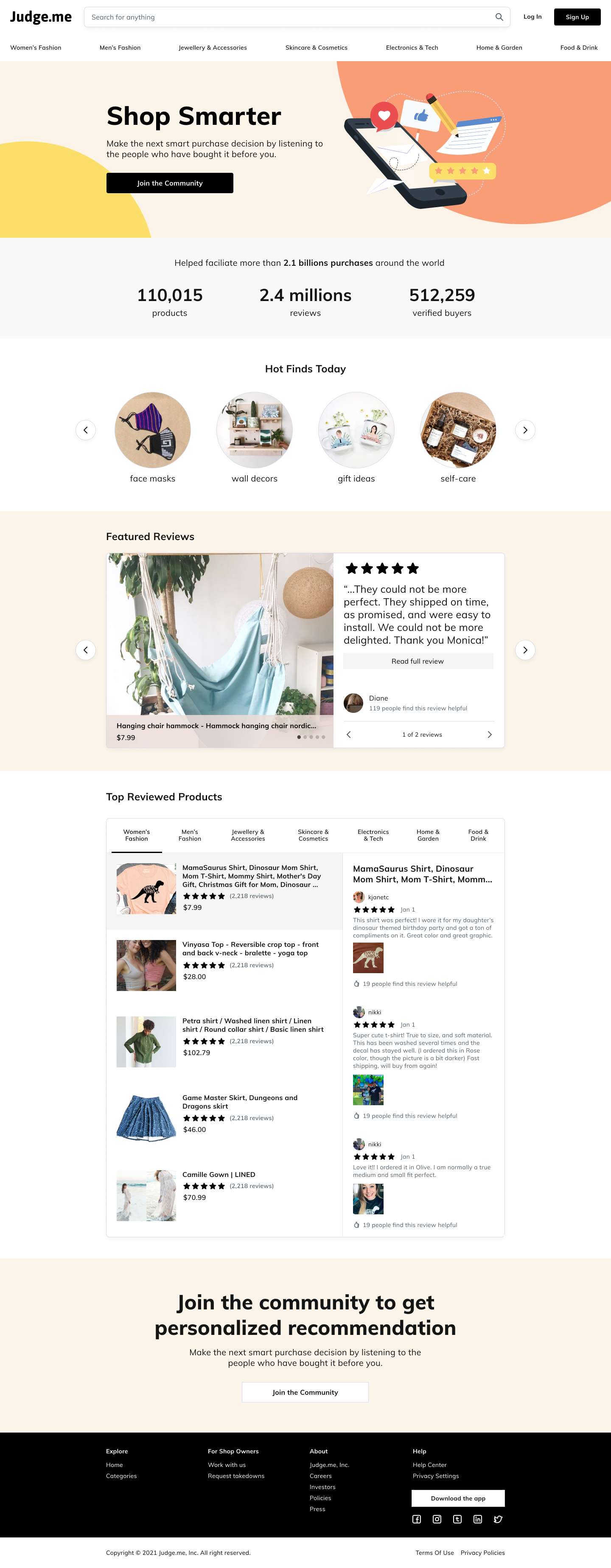
- She gets onto the website and is presented with the home page. The home page solidifies its value offering with a big heading and CTA button to join the community. There are categories to narrow down the scope if she isn’t sure what she is looking for. Since it doesn’t know her preferences, it shows featured reviews – highlighted reviews worth checking out. It also shows top products by categories.
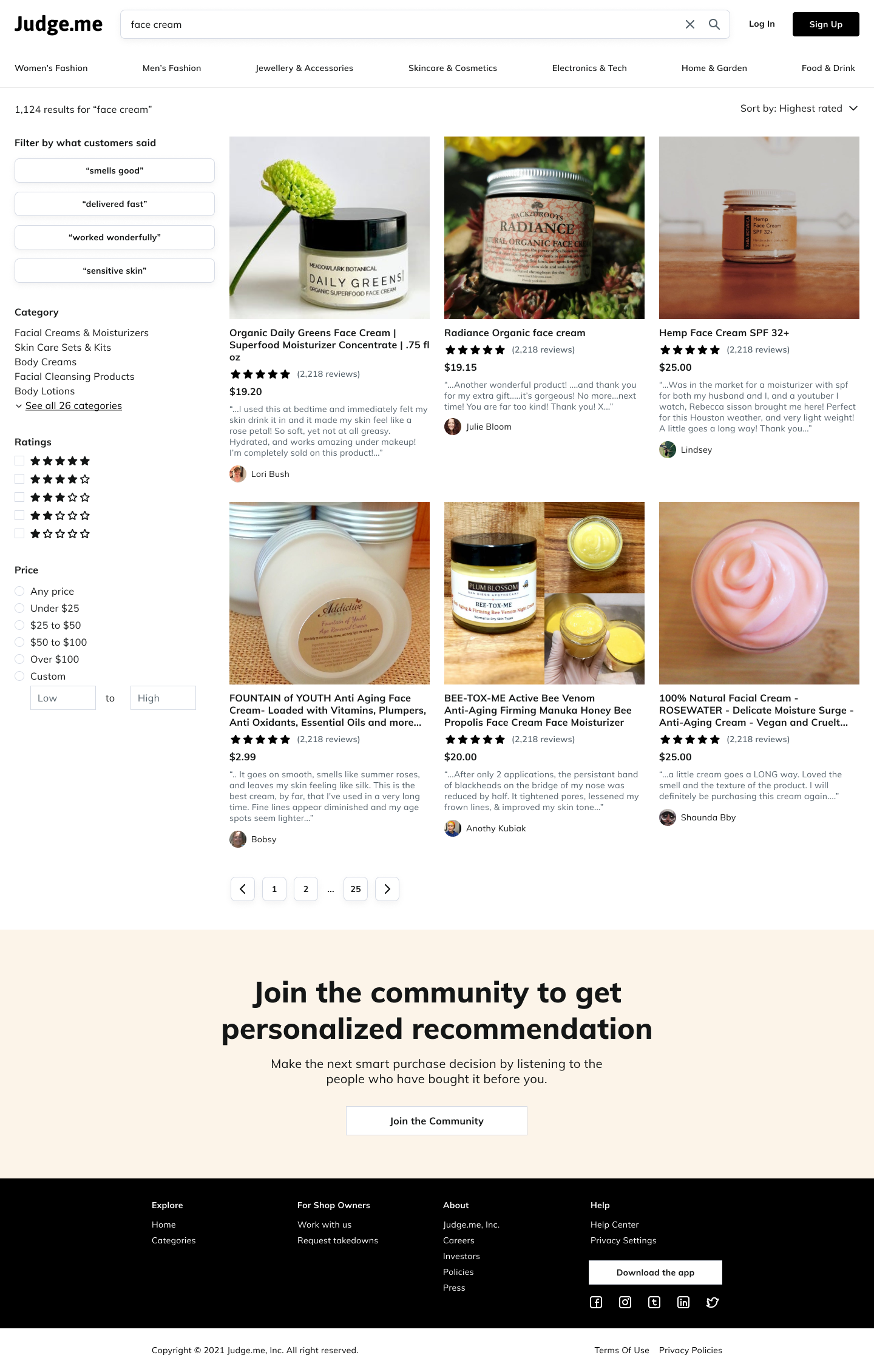
- She ignored the home page and try to narrow down her search to “face cream”.
- She is then presented with a list of results, each of them has a highlighted review about them, and allowing her to sort by number of reviews, top scores…
- She also finds that there is a way to narrow down the result based on qualitative keywords such as “smells good”, “quick delivery”, “absorb well”…
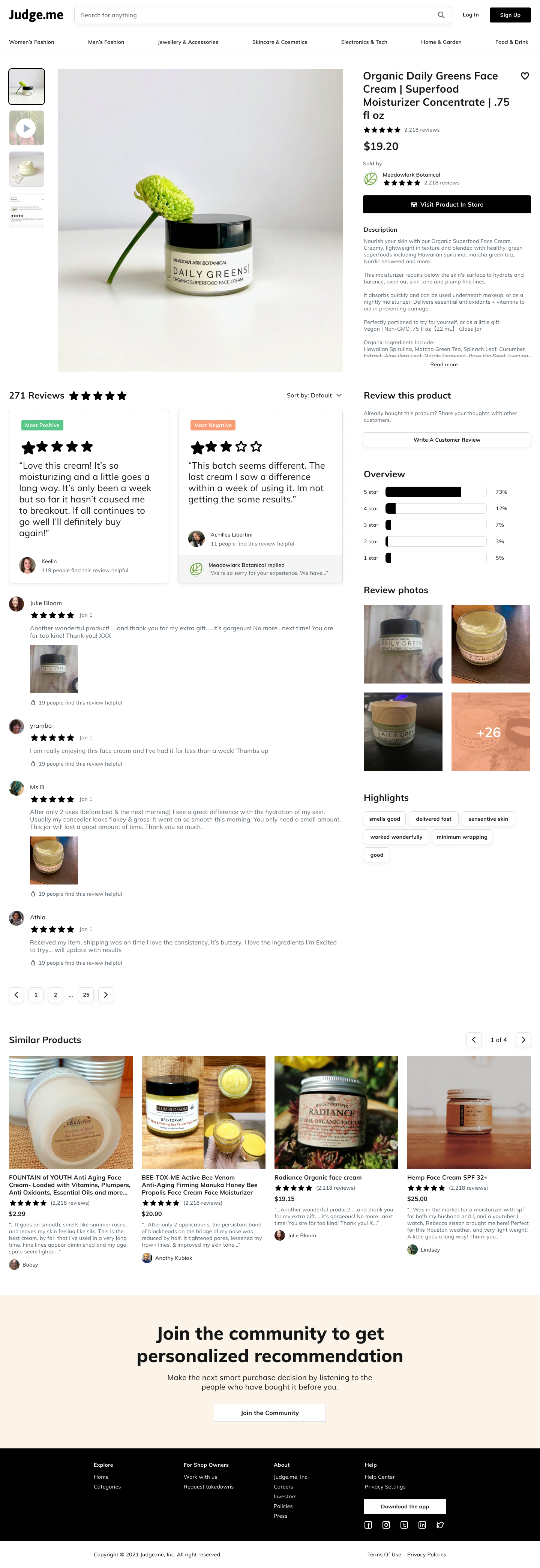
- She finds one of the product that she’s interested in and click on it
- She is presented with a product detail page with product image, price, name and a lot of reviews. As a buyer, she wants to have an objective look at the products so the most positive and most negative reviews are highlighted. This way, she can make a truly informed decision.
- She wants to know more details about the product so she click views the product in store, this open the shop’s website in an iframe so that users are not taken away from the platform.
- If she is not satisfied with the product, she wants to browse other similar ones.
- After a while, she finds a product she likes and commit the purchase
- Several days later, and she got prompted to leave a review for the product.
- She click on the link in the email and it takes her to a form for leaving review.
- She leave her review and is presented with an option to create an account to join the community of smart shoppers. This ways he can get personalized recommendations about product she might like.
- She created an account, establishing her presence on the platform.
- She can react to other reviews, granting them more credibility.
- She sees a review that she finds interesting, and click on the reviewer name to open the reviewer’s profile, which lists all their previous reviews.
- She can see the social value of being a good reviewers, and is more inclined to leave reviews from now on.
Information Architecture
Based on the touchpoints that the Jaycie is exposed to, I have come up with the following screens and their information.

Low-fidelity Wireframes
While doing the IA, I have also drafted a rough wireframes of some key screens to get a visual sense of what the information entails.

User Flows
Wiring the screens and together, I have created this user flow. This should give me a bird’s eye view of the relationship between the screens, and what to include in each screen.

Hi-fidelity Wireframes
Before jumping onto detailed visual, I went through a round of high-fidelity wireframes to get a clearer sense of what I’m trying to achieve.
It’s hard for me to run through all the design decisions I’ve made in this post format so if you want to know more I am glad to walk you through them.
Home

Search Results

Product Detail

Reviewer Profile

Visual Style
With the current persona, I’ve decided to use the following inspirations as mood board. The key characteristic is neutral colors so that it doesn’t get in the way of the product images, and muted warm accent colors to create subtle excitement.

The style guide is as follows.

High-Fidelity Mockups
Incorporating the visual style into the wireframes, here is the final look and feel of the website.
Home
Search Results
Product Detail
Conclusion
Thank you for such an interesting UX Challenge. I would love to do more, but due to time constraints, this is all I can achieve.
I think the most challenging part of this assignment for me is understanding how an ecommerce platform works. I must admit I don’t have much experience in this specific type of website, but I can always learn about it, as I have demonstrated the process in which I tried to understand the problems above. My apologies if it is too lengthy.